
Best Color Palettes for Sophisticated Home Offices
The home office has become an important part of our lives. Long gone are the days of squeezing a desk into a random corner and calling it an office. Now, people are designing *home workspaces* that are elegant, practical, and inspiring. If you’re working from home all the time or just need a nice place to check off your to-do list, your home office should serve more than one purpose: it needs to work well for you, show your style, and help you feel efficient.
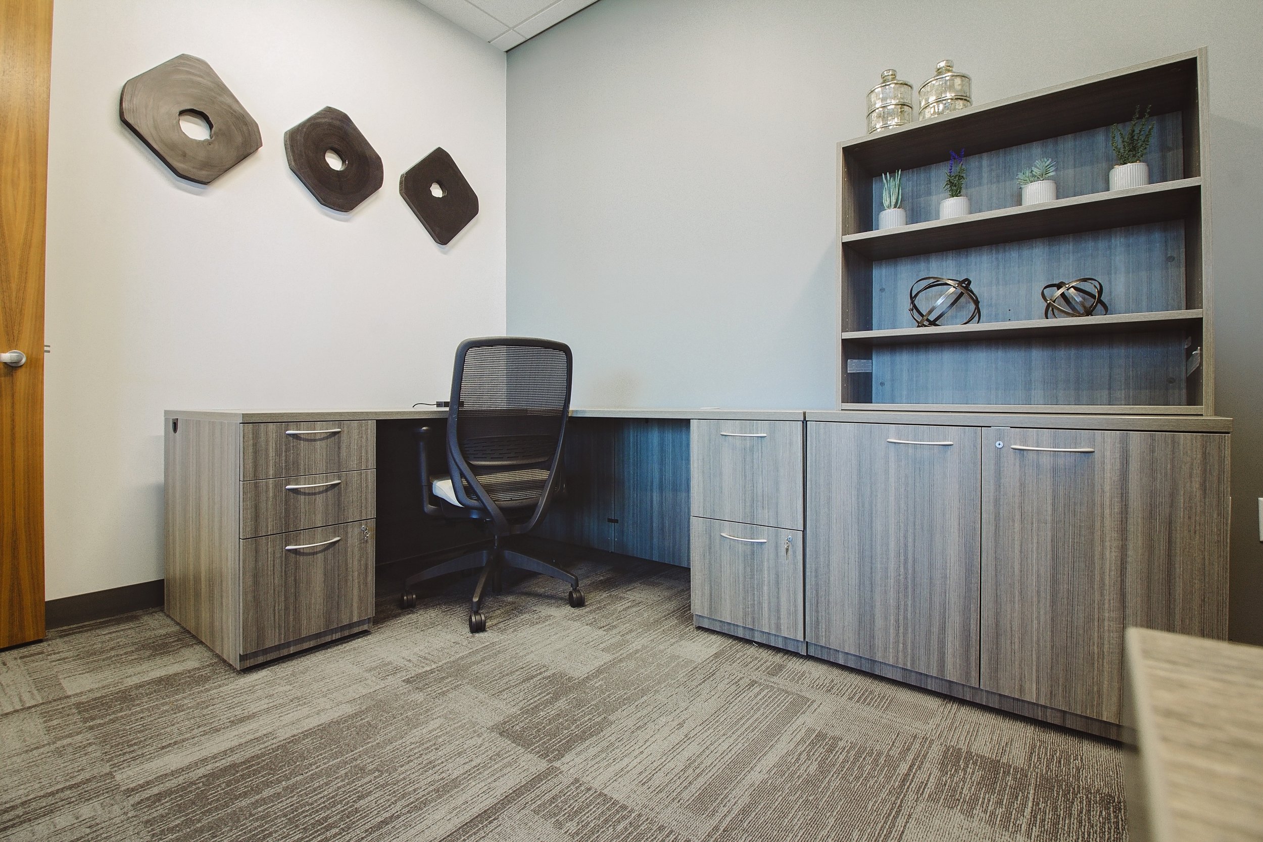
At Aeroview Design Co, we believe every great home office starts with the right colors. A home office color scheme can totally change the way a room makes you feel. It can help you stay calm, creative, and focused. In this post, we’ll look at some of the best color ideas, along with tips for putting them together, so you can design a workspace that helps you succeed.
Why Colors Matter in Your Home Office
The colors in your home office aren’t just about making things look nice. They can also affect how you feel and work. Research shows that certain colors can help you focus, get creative, or feel more energized. Want to use color to improve your home office design? Here’s what to consider:
- Stay Productive: Cool colors like blue and green can help you focus without feeling stressed, while brighter colors like orange or yellow can make you feel energetic and creative.
- Look Professional: Neutral colors, like gray or beige, make your space look tidy and polished—great for video calls with coworkers or clients.
- Feel Calm: Soft, muted colors like sage green or light gray help create a soothing environment, which can make long workdays feel less tiring.
The goal is to find a mix of colors that suits your personality and keeps you balanced. You’ll want shades that give you energy without being too loud or making you feel drowsy.
What Makes a Color Palette Feel Sophisticated
When we say "sophisticated," we’re talking about a color scheme that looks purposeful and put together. It’s not about being fancy—it’s about picking colors that work well together and create a vibe that’s both elegant and practical. Here’s how to make your home office look polished:
- Go for Muted Tones: Avoid super bright, flashy colors. Instead, try softer shades like dusty blues, warm grays, or taupes, which give a more refined look.
- Mix Neutrals with Pops of Color: Add a small splash of bold color or a shiny accent, like metallics, to make things interesting without being overwhelming.
- Add Textures: Think about using soft fabrics, matte paint, or metal finishes to make the space feel layered and inviting.
Lighting is also a big deal. Natural light will make your *home office color palette* look bright and lively, while artificial light can change how the colors appear.
Top Neutral Colors for a Calm and Elegant Home Office
Neutral colors are a great starting point when you're designing your office. They’re easy to work with, create a peaceful feel, and give you the freedom to add colorful accents later. Here are 10 neutral shades that can help transform your home office into an elegant and calm space:
1. Warm Beige – Cozy and timeless.
2. Cool Greige (gray + beige) – A trendy and versatile choice.
3. Pure White – Bright and clean, making the room feel larger.
4. Ivory – A creamier white that adds a little warmth.
5. Soft Taupe – An earthy color that feels classic.
6. Stone Gray – Modern and sleek, great for a professional look.
7. Charcoal Gray – Darker, for a bold and grounding effect.
8. Light Dove Gray – Subtle and calming.
9. Cream – Warm and inviting, perfect with colorful accents.
10. Sage Green – A soft green with natural undertones for a peaceful vibe.
Use these shades as your main color for walls, furniture, or storage pieces to create a professional yet calming workspace.
Add Some Style with These Accent Colors
Once you’ve laid down your neutral foundation, it’s fun to bring in a bit of personality with accent colors. These pops of color can make the space more exciting and unique while still looking classy. Here are 10 great options for accent shades:
1. Navy Blue – Strong and calming.
2. Deep Emerald Green – Rich and luxurious for a bold touch.
3. Burnt Orange – Warm with a creative twist.
4. Burgundy – Dramatic and elegant.
5. Mustard Yellow – Adds a cheerful, golden glow.
6. Slate Blue – Cool but timeless.
7. Mauve – A soft pink-purple for a delicate, vintage feel.
8. Terracotta – A warm, earthy orange that feels comforting.
9. Gold or Brass – Shiny and glamorous for a modern touch.
10. Blush Pink – Soft, chic, and subtly stylish.
You can introduce these colors through accessories like decor, artwork, furniture, or a small feature wall. Keeping them as accents ensures your space won't feel too overwhelming.
Color Combinations That Always Work
If you’re not sure where to start, here are five pre-designed *home office color palettes* you can try. These combinations balance neutral tones with elegant accents to create a cohesive design.
a. Modern Minimalist
- Main Color: Charcoal Gray
- Accent: Off-White
- Metal Element: Matte Black
This sleek design is perfect for anyone who loves simplicity.
b. Natural and Relaxing
- Main Color: Sage Green
- Accent: Terracotta
- Neutral Tone: Cream
This combo brings the outdoors indoors for a calming vibe.
c. Bold and Classic
- Main Color: Navy Blue
- Accent: Mustard Yellow
- Neutral Tone: Ivory
This mix is professional but has a touch of energy.
d. Warm and Cozy
- Main Color: Soft Taupe
- Accent: Burnt Orange
- Neutral Tone: Warm Beige
Great for creating a welcoming workspace.
e. Elegant and Soft
- Main Color: Blush Pink
- Accent: Gold
- Neutral Tone: Pure White
This is perfect for a chic and feminine look.
Tips for Using Your Color Palette
Once you've picked your favorite colors, it's time to bring them to life. Here’s how to use your *home office color palette* to create a space that works beautifully:
1. Walls: Paint your walls in the main neutral tone, and consider adding one accent wall for a pop of color.
2. Furniture: Choose pieces that fit your colors, like a navy desk or a sage chair.
3. Decor: Accent your space with rugs, curtains, or cushions that match your chosen shades.
4. Metal Finishes: Add brass or gold details through light fixtures or desk supplies.
5. Lighting: Use full-spectrum bulbs to show off the true beauty of the colors.
Make Your Office a Place You Love

Designing a sophisticated home office is about more than just function. It’s about creating a space that fuels your creativity, keeps you motivated, and makes you feel at ease. With the right home office colors, your workspace can be both stylish and efficient.
At Aeroview Design Co, we’re here to help you turn your ideas into reality. Whether you need help designing your office or choosing the best color palette, we’re ready to assist you.
Let’s create a space that inspires you to do your best work. Contact us today to get started!
Want a step-by-step breakdown of these color palettes and expert styling tips? Download my free guide, 'The Ultimate Home Office Color Guide,' to get exclusive insights and curated resources that will help you create a space that’s both beautiful and functional.